Keith Minnion is something of a renaissance man. He is probably best known as an illustrator and as such he is one of the busiest in the horror fiction world. Since 1979, Keith has remained in constant demand and is extremely popular with the fans and collectors.
Keith Minnion has also been a publisher. His White Noise Press produced some of the most lavish and beautiful chapbooks that the genre has ever seen. Publishing such critically acclaimed authors as Brian Keene, Kealan Patrick Burke, Elizabeth Massie and Gary Braunbeck, White Noise kept the prices affordable for all, when many of its competitors were charging much more for inferiorly made chapbooks.
And Keith Minnion has been quietly publishing thoughtful, beautifully-written short stories since 1979 as well. His fiction has graced Asimov's SF Magazine, Cemetery Dance and other quality markets.
Horror Drive-In is pleased and proud to present to you a new work of fiction by Keith Minnion. SO MUCH FOR THE COMPETITION is lean and meaner than most of Keith's fiction. We think you'll like it. Oh and stick around after the feature and we'll pick Keith's brain a bit.
The man on the roof squinted in the morning sunlight, contemplating the people in the park below. He sat comfortably on a low air-conditioning vent, his legs braced on the roof�s retaining wall. He cradled his rifle in his lap. Twelve stories down, the faces were too small to be distinguishable, to make them people, to make them mean � anything.
Good, he thought. Very good.
He felt the power in him, the surge in his arms, hands, and fingers, the electricity that jumped from him to the blue-steel barrel, the high-power scope, and the finely tooled walnut stock.
Soon, he told himself. He stood the rifle between his knees. Very soon, now.
He heard a sound at that moment, from somewhere behind him. He turned his head. An old woman, a green watering can in hand, stood at the doorway to the stairs leading down into the building. He didn�t move. Could she see the rifle?
She said, "I have to water my flowers."
He stared at her intensely, squinting his eyes again. Apparently not. He nodded. "Sure," he said. "Knock yourself out."
She shuffled over to a corner of the roof where several flats of tired-looking marigolds and zinnias lay in the strong sunlight. "They really need it in this heat," she said, over her shoulder.
He smiled. Yes, he thought, they certainly did need it. And they will get it; they will get it indeed. He watched her as she stooped over each flat, and wondered: Will I kill her? Will she be the first?
A passenger jet thundered by, so low he could hear the air snapping behind it as it passed overhead. He closed his eyes, put his fingers to his temples. Oh God, he thought. Oh God.
When he opened them again the door to the stairway was closed, and the old woman was gone.
"Damn you," he said. "You're rushing me, now."
He turned back to the street and park below, to the people sitting on the benches there. He raised his rifle, relaxed his eyes, and took aim through the scope. He released the safety with his thumb, and then eased his forefinger onto the trigger. He focused on what he found beyond the crosshairs, a stout woman in a too-tight dress, clutching a department store bag in one hand and a hot dog dripping mustard in the other.
Relax, now, he told himself. She will never even hear the shot, never even feel it.
There was a faint crack, like a thin branch snapping, somewhere above, somewhere behind.
The man on the roof slumped to the side, a neat hole in the back of his head, his face in ragged pieces splashed and sprayed along the low retaining wall and out, into the air. The rifle slipped from his fingers and slapped into the blood pooling at his feet.
Two blocks away, and two stories higher, the other sniper lowered his rifle. "So much for the competition," he muttered, and turned to contemplate the crowds below.
Interview with Keith Minnion
 Horror Drive-In: Thanks for joining us at the Horror Drive-In fiction section, Keith! Most people know you from your amazing artwork, but you're also a very good short story writer. Do you have any writing projects in the works? Any chance we'll see a collection of your short stories, or maybe even a novel?
Keith Minnion: First of all, I am glad (and a bit humbled!) to be here. Thanks for inviting me. Writing projects? Sure, several! I am always working on a short story of some kind. Several in the works include a horror story called "Island Funeral" that is nearly done, a young adult story that may grow into a short novel called "Stars For My Pillow, Moons For My Bed" - that one is about a quarter done, and a few SF stories, "Visits To The Memory House", "Bushido" and a few more, that are done but gestating in a file drawer. I try to let them sit until I forget them, then go back with, hopefully, a fresh, critical eye. You have to understand I complete stories at about the same pace that cicadas breed, so my sum total of professionally published stories is rather small. Thirteen? Fourteen? Since 1979?? I doubt I have enough for even a SLIM story collection!
I have an SF novel - called "The Beggar's Gate" - completed. It is sitting in a drawer while I get some distance before I return to edit it. I also have a horror novel - "The Bone Worms" - done, and this one is currently with a publisher I greatly admire, being "considered." You have to have the patience of a saint, I've learned, but that's okay. While I wait, I am writing another novel, a military-themed eco-thriller called "Red Means Run" based in part on the two and a half years I spent stationed on Adak in the Aleutians back in the early 1980s. That one's a lot of fun to write (WETSU, as they say), and I am about halfway through it.
HD-I: Sounds like you have some interesting and diverse projects on the horizon that we can all look forward to. And speaking of "slim story collections," you produced some of the nicest chapbooks anyone's ever seen via White Noise Press. You stepped away from White Noise last year in order to pursue other interests, one of which was going back to school, if I'm not mistaken. First, how is your schooling going? Also, do you think White Noise is something you'll come back to down the road?
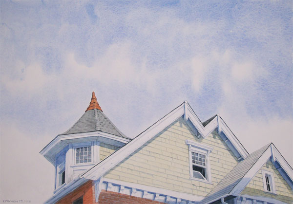
KM: My original plan was to retire from Government service (after 30 years) at age 55 and then go off to graduate school and get an MFA in Painting so that I might be able to teach drawing and painting at the university level. That was on track until I was offered this really cool job working for the Public Printer, a Legislative Branch job. So I took the job and put the grad school plan on a back burner. The good news out of that was the series of watercolor paintings I was doing to build my grad school presentation portfolio turned out some decent work, which I am continuing, averaging a painting a month. I am hoping to have a gallery show out of the best of them in the near future. You can see some of these on my website in the section, "Roofscape"
As for White Noise Press, that was something I just wanted to try, to see if I was any good at it. I have always loved doing graphic design and layout, and I happened to own an old Swingline saddle stapler, and I thought that the WNP logo itself was a really cool logo design solution, so I thought, what the hell. I had no plans other than to approach writers I admired and see if they were interested in having a hand-crafted chapbook done for a new story of theirs. I was lucky in having most of the writers I approached agree to participate, and the two-year run of White Noise Press limited edition handmade chaps was the result. In the end things got a little wacky. Not being a book collector myself, I had no idea of all the "collector" rules I was apparently breaking, left and right, over and over. Pissed a certain number of people off, if unintentionally. It got to the point where it was absolutely no fun at all, and I just decided to step away. It WAS fun, though, for awhile.
HD-I: I'm sorry to hear that things went south toward the end. That's a shame. If it's any consolation, everyone I knew who grabbed copies of your chapbooks thoroughly enjoyed the stories and presentation, myself included.
One last question about writing/books and then we'll delve into your artwork. Can you describe your role with the Cemetery Dance chapbooks? Are you doing just the designs and layouts, or are you also creating the chapbooks like you did with White Noise?
KM: I started doing CD Publications chapbook cover art early on. I did the Richard Laymon "Tell Me A Tale" chap cover, which I think was their first one. Then I did a Jack Ketchum cover, then a Ray Garton. All of them incorporated typography in the overall design. After White Noise Press got going, I was asked by CD to take on the job of designing and laying out all of their promotional chapbooks. In two cases so far they sent cover art with the manuscript copy, but for the rest I have been doing the cover illustrations as well. These are all printed professionally, so what I do is deliver native file layouts in Adobe InDesign, as well as press-ready PDF files, and that's where my involvement ends. They are not printed and bound by hand the way the White Noise Press chaps were. I could not imagine doing a handmade chap edition running five hundred to seven hundred copies anyway! With the two chapbooks I've done for Lonely Road Books - one a Stewart O'Nan story associated with his POE book, the other an Arthur Darknell story associated with the Darknell double book - I was able to push the limits a bit with extra interior art, two color covers, and inside cover art. These two are at the printer right now (literally! I had to answer a question from the printer only last week), and I am really looking forward to seeing how they come out.
 HD-I: Moving on to your artwork.......who were your early mentors and influences?
KM: I love talking about this stuff! In college I was a painting major for awhile, and since it was the early 1970s we were exposed mainly to the Minimalists (Ryman, Mangold, Mardin, etc.), the color field Abstractionists (Styll, Stella, Motherwell, Rothko, etc.) and the Conceptualists/Post-Conceptualists (whose names I can't even recall - shows you how important THAT art movement was to me!). On my own, I studied the Pre-Raphaelites, Symbolists and Decadents - art movements from the late Victorian period. I studied painters like Burne-Jones, Waterhouse, Bocklin and Millais, among others. I loved that stuff, and still do. I also studied the work of Andrew Wyeth and Robert Vickery, specifically how they painted in egg tempera and watercolor. I was lucky in that one of my college professors was Rudolph Zallinger, the famous dinosaur painter (Golden Book of Dinosaurs, anyone?) who taught me egg tempera hands-on, the traditional fourteenth century techniques using pure mineral ground pigments, distilled water and egg yolk on tempered panels of marble dust/rabbitskin glue gesso. Zallinger taught me the value in using only the best tools and materials, which is why today I use Arches paper, Winsor & Newton sable brushes, and Winsor & Newton paints exclusively. I still use the egg tempera painting techniques in my acrylic paintings, but save the eggs for breakfast.
As for illustrators, my major influences studied, lived and worked in the same Delaware Valley area where I live today, namely Howard Pyle, N.C. Wyeth, Joseph Clement Cole, Violet Oakley and Maxfield Parrish. Every time I do an ink drawing, or start planning out the composition of a piece, I think of those guys (and gal!). The main illustrator working today who I look at with my mouth open and drooling is Roger Dean. Un-freaking-believable imagery, color-use and technique. I also admire the work of my friend Steve Gilberts - consistent, thoughtful quality stuff.
HD-I: How wonderful to have a mentor in college who so greatly affected your work! I love hearing about those kinds of experiences. Have you had the opportunity to work with up-and-coming artists via classes, seminars, etc?
KM: I was a public school art teacher for a year after college - taught 5th and 6th Grade art. That was an absolute blast, but then I received a commission as an officer in the Navy, and that was a whole lot MORE fun, so I left public school teaching behind. I recently taught an Adult Education Class in Drawing through my local school system. Imagine a room full of 30-something moms surrounding a nude model standing on a table and me urging them to do five-second gesture sketches.... Beyond that, whenever anyone emails me with questions I try my best to help them out. One well known illustrator in the Horror genre really picked my brain when he was first starting out, and I was happy to help. Whenever I see something I can't figure out, I contact the illustrator and ask them how they did it. We're all colleagues, after all.
HD-I: As someone who has no artistic talent whatsoever, I've never been able to look at a piece of art and wrap my head around how the artist actually creates his work. However, you've made an effort to show the process on your website. A couple years back you walked through each step of creating the cover art for James Newman's THE WICKED. I also just found out that you did a similar thing for Full Moon Press' release of FRANKENSTEIN.
Can you summarize your process as far as materials you prefer to use, length of time it takes to complete something similar to the aforementioned works, etc? Also, how often do authors/publishers have input into your creative process vs. just letting you run with your own ideas?
KM: For drawing I try to keep it simple and only use two media: pencil or ink. My pencil illustrations are done with a variety of hardness grades (pencil grades go from H for hard, to B for soft). For really deep blacks I will use a 6B soft pencil or an ebony pencil; for most of the rest, I use a normal No. 2, or an HB, rarely anything harder than a 2H. I tend to work mostly on Coquille Board, which is just a thick bristol stock with a built-in molded texture to its surface. If I drag the pencil over the surface of a Coquille Board very lightly, the graphite lead is only deposited on the tops of the tiny paper bumps, creating an instant, soft
texture. When I apply more pressure to the stroke, I can manipulate the texture, making it easy to simulate flesh or wood or water. For my ink illustrations I use Rapidograph technical pens of various sizes on Arches watercolor paper. I almost always use a stippling technique to create surfaces and textures - thousands of tiny dots that tend to blend together, fooling the eye to think they are seeing shades of grey. For solid black areas I use a brush. The trick is to blend the stippled areas with the brushed areas so that the viewer can't tell where one area stops and the other starts. That just takes practice. What makes me choose one media over the other? Deadlines. If I have a lot of time, I have the luxury of using ink. If I don't, then pencil is the way to go. Prior to the digital printing advances I was almost always asked to deliver ink illustrations, pure black and white line images, because of the limitations and costs of dealing with halftones in the antediluvian offset printing environment. These days it all ends up as a TIF or a JPEG file, pixel to plate, as they say, so no one cares.
For color work, covers and frontispieces, I sometimes do a watercolor, but mostly I paint in acrylic polymer. I have always preferred water-media painting - watercolor, egg tempera and acrylic - for a variety of reasons. For illustration work, where there is invariably a short deadline, I can't wait around for a glaze of oil paint to dry so I can apply the next glaze. It just takes too long. Acrylic only takes as long as it takes the water to evaporate. Blending isn't as easy as with oil, but there are a bunch of techniques around that. My training in egg tempera painting has proved invaluable in this. I use the standard soft and bristle brushes, but I also use a range of sea sponges, cloths and even big house painter brushes to get the effects I am after. Also splattering. I LOVE splattering paint around, then tightening down on top. If you look at the series of steps I went through doing that Frankenstein cover, you can see the splattering/glazing/splattering that went on. This is CLASSIC Wyeth and Vickery techniques in egg tempera, and it works just as well with acrylic.
It usually takes me an evening or two to do research for any piece, drawing or painting. I keep a huge morgue of newspaper and magazine photo clippings, organized into categories like "Female Face", "Male Standing", "Hands", �Animals�, etc. that I use for reference all the time. When I can get a live model, that's great, but I sometimes email one of my children (one is at college and the other lives in Virginia) with a request that they pose in a certain way, have someone take a digital photo, and send it back to me. I just did that for an endpaper illustration for an upcoming Brian Keene novella for CD: I needed a man's hand clutching a chain link fence, so I got my daughter to take a photo of her husband grabbing a fence and send it to me, and that was that. Pencil drawings I can do in a day. Ink drawings can take up to a week. Because I can only work evenings and on weekends, cover paintings can take up to three weeks. I work small enough to fit the painting on my flatbed scanner, though, so sometimes I can do a painting in less time. Again, it's all about the deadline. I never miss them.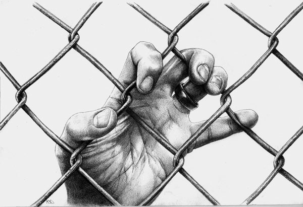
As for who gets to choose the subject matter, I have been very lucky in working with Rich Chizmar, Brian Freeman and Mindy Jarusek at CD Publications, and Chris and Barbara Roden at Ash Tree Press, who trust me enough to let me do whatever I think is best for an illustration. I have this stubborn work ethic that says publishers should publish, editors should edit, writers should write, and illustrators should illustrate; no mixing of roles, please. I have never been happy with anything I have done where the content was dictated by a publisher, an editor, or a writer. Writers (hey, I LOVE all writers! Where would an illustrator be without them?) almost always want either a montage of five or six different ideas in one illustration (there should only be one focus in an illustration!) or they want some climactic scene drawn that ALWAYS works better in the imagination of the reader. I do remember once in the mid 1990s when because of a deadline situation Rich Chizmar emailed me illustration ideas for all six stories in a certain issue of Cemetery Dance Magazine � I didn't even get to read the manuscripts, just riffed off of Rich's suggestions for images to get them all done in a weekend - but nobody seemed to mind the end result. That was actually a lot of fun.
HD-I: Do you present your artwork at shows or galleries? Also, are prints of your artwork available for purchase?
KM: My last gallery show was in conjunction with two other horror art photographers in 2007 at a local gallery in Perkasie, PA.
My last convention show was NECON 27. I plan on showing some new work at NECON 29 this July. When I get about twenty watercolors done in my �Roofscape� series I will be pursuing a gallery show for them, maybe in a year. At one time I had prints for sale online, but I currently do not have any prints for sale.
HD-I: One last question: A couple years back you did extensive artwork for Al Sarrantonio's THE BABY novella, which was released as part of Cemetery Dance's Signature Series (your work was fantastic, by the way). At one point you had also been working on a graphic-novel adaptation with James Newman and his novella entitled HOLY ROLLERS. First, is there any chance the HOLY ROLLERS project will be revisited in the future? And second, do you have plans to do any graphic-novel or illustration-intensive projects down the road?
KM: I was invited by Rich Chizmar and Brian Freeman to do that Signature Series book of Al's, and I was honored to do it. I was lucky to have contributed interior illustrations to nearly all of the earlier Orangefield books that Al had put out, and it was a blast to enter that October Country town one more time. I have no assignment currently to do something similar, though.
What working on that comic book version of "Holy Rollers" taught me is that comic book illustration is a crapload of work! James and I knew there wouldn't be any point in going further than three panel sheets without some sort of contract, and that didn't happen, so we both scrapped the idea and moved on. It was a lot of fun learning a new thing, though. My admiration for the people who do comic books for a living knows no bounds. But again, I have no assignment on the board to do anything like that, and have no plans myself to do one. I stopped actively pursuing illustration assignments several years ago, actually, and only take on projects now if approached, and then only on an occasional basis. I'm enjoying the time I have to work on my watercolor paintings and writing projects!
HD-I: Thanks so much for the informative interview! We sincerely appreciate it, Keith.
Select Keith Minnion Bibliography:
Ghosts Asimov's SF Adventure Magazine Summer 1979
On The Midwatch Asimov's SF Magazine November 1979
Ghosts - Reprint Asimov's Adventures of Science Fiction (HC) 1980
A Trail of Footprints Asimov's SF Magazine September 1981
Empire State Asimov's SF Magazine May 1985
The Prince's Birthday Dragon Magazine June 1987
Diner at the Alter (EATS) Modern Short Stories August 1989
Three Wizards Marion Zimmer Bradley's Fantasy Magazine Winter 1990
Empire State (Reprint) Why I Left Harry's All-Night Hamburgers (HC) 1990
Killer Night Terrors #1 June 1996
Dead End Night Terrors #3 April 1997
A Death in the Forest Night Terrors #6 June 1998
Turn of a Card The Edge #9 Spring 2001
It's For You Cemetery Dance #34 Spring 2001
Up in the Boneyard Shivers IV April 2006
Killer (Reprint) Down in the Boneyard October 2006
Dead End (Reprint) Down in the Boneyard October 2006
Eats (Reprint) Down in the Boneyard October 2006
Turn of a Card (Reprint) Down in the Boneyard October 2006
It's For You (Reprint) The Shadow On The Shade February 2008
Room To Let The Shadow On The Shade February 2008
Keith Minnion has also been a publisher. His White Noise Press produced some of the most lavish and beautiful chapbooks that the genre has ever seen. Publishing such critically acclaimed authors as Brian Keene, Kealan Patrick Burke, Elizabeth Massie and Gary Braunbeck, White Noise kept the prices affordable for all, when many of its competitors were charging much more for inferiorly made chapbooks.
And Keith Minnion has been quietly publishing thoughtful, beautifully-written short stories since 1979 as well. His fiction has graced Asimov's SF Magazine, Cemetery Dance and other quality markets.
Horror Drive-In is pleased and proud to present to you a new work of fiction by Keith Minnion. SO MUCH FOR THE COMPETITION is lean and meaner than most of Keith's fiction. We think you'll like it. Oh and stick around after the feature and we'll pick Keith's brain a bit.
The man on the roof squinted in the morning sunlight, contemplating the people in the park below. He sat comfortably on a low air-conditioning vent, his legs braced on the roof�s retaining wall. He cradled his rifle in his lap. Twelve stories down, the faces were too small to be distinguishable, to make them people, to make them mean � anything.
Good, he thought. Very good.
He felt the power in him, the surge in his arms, hands, and fingers, the electricity that jumped from him to the blue-steel barrel, the high-power scope, and the finely tooled walnut stock.
Soon, he told himself. He stood the rifle between his knees. Very soon, now.
He heard a sound at that moment, from somewhere behind him. He turned his head. An old woman, a green watering can in hand, stood at the doorway to the stairs leading down into the building. He didn�t move. Could she see the rifle?
She said, "I have to water my flowers."
He stared at her intensely, squinting his eyes again. Apparently not. He nodded. "Sure," he said. "Knock yourself out."
She shuffled over to a corner of the roof where several flats of tired-looking marigolds and zinnias lay in the strong sunlight. "They really need it in this heat," she said, over her shoulder.
He smiled. Yes, he thought, they certainly did need it. And they will get it; they will get it indeed. He watched her as she stooped over each flat, and wondered: Will I kill her? Will she be the first?
A passenger jet thundered by, so low he could hear the air snapping behind it as it passed overhead. He closed his eyes, put his fingers to his temples. Oh God, he thought. Oh God.
When he opened them again the door to the stairway was closed, and the old woman was gone.
"Damn you," he said. "You're rushing me, now."
He turned back to the street and park below, to the people sitting on the benches there. He raised his rifle, relaxed his eyes, and took aim through the scope. He released the safety with his thumb, and then eased his forefinger onto the trigger. He focused on what he found beyond the crosshairs, a stout woman in a too-tight dress, clutching a department store bag in one hand and a hot dog dripping mustard in the other.
Relax, now, he told himself. She will never even hear the shot, never even feel it.
There was a faint crack, like a thin branch snapping, somewhere above, somewhere behind.
The man on the roof slumped to the side, a neat hole in the back of his head, his face in ragged pieces splashed and sprayed along the low retaining wall and out, into the air. The rifle slipped from his fingers and slapped into the blood pooling at his feet.
Two blocks away, and two stories higher, the other sniper lowered his rifle. "So much for the competition," he muttered, and turned to contemplate the crowds below.
Interview with Keith Minnion
Horror Drive-In: Thanks for joining us at the Horror Drive-In fiction section, Keith! Most people know you from your amazing artwork, but you're also a very good short story writer. Do you have any writing projects in the works? Any chance we'll see a collection of your short stories, or maybe even a novel?Keith Minnion: First of all, I am glad (and a bit humbled!) to be here. Thanks for inviting me. Writing projects? Sure, several! I am always working on a short story of some kind. Several in the works include a horror story called "Island Funeral" that is nearly done, a young adult story that may grow into a short novel called "Stars For My Pillow, Moons For My Bed" - that one is about a quarter done, and a few SF stories, "Visits To The Memory House", "Bushido" and a few more, that are done but gestating in a file drawer. I try to let them sit until I forget them, then go back with, hopefully, a fresh, critical eye. You have to understand I complete stories at about the same pace that cicadas breed, so my sum total of professionally published stories is rather small. Thirteen? Fourteen? Since 1979?? I doubt I have enough for even a SLIM story collection!
I have an SF novel - called "The Beggar's Gate" - completed. It is sitting in a drawer while I get some distance before I return to edit it. I also have a horror novel - "The Bone Worms" - done, and this one is currently with a publisher I greatly admire, being "considered." You have to have the patience of a saint, I've learned, but that's okay. While I wait, I am writing another novel, a military-themed eco-thriller called "Red Means Run" based in part on the two and a half years I spent stationed on Adak in the Aleutians back in the early 1980s. That one's a lot of fun to write (WETSU, as they say), and I am about halfway through it.
HD-I: Sounds like you have some interesting and diverse projects on the horizon that we can all look forward to. And speaking of "slim story collections," you produced some of the nicest chapbooks anyone's ever seen via White Noise Press. You stepped away from White Noise last year in order to pursue other interests, one of which was going back to school, if I'm not mistaken. First, how is your schooling going? Also, do you think White Noise is something you'll come back to down the road?
KM: My original plan was to retire from Government service (after 30 years) at age 55 and then go off to graduate school and get an MFA in Painting so that I might be able to teach drawing and painting at the university level. That was on track until I was offered this really cool job working for the Public Printer, a Legislative Branch job. So I took the job and put the grad school plan on a back burner. The good news out of that was the series of watercolor paintings I was doing to build my grad school presentation portfolio turned out some decent work, which I am continuing, averaging a painting a month. I am hoping to have a gallery show out of the best of them in the near future. You can see some of these on my website in the section, "Roofscape"
As for White Noise Press, that was something I just wanted to try, to see if I was any good at it. I have always loved doing graphic design and layout, and I happened to own an old Swingline saddle stapler, and I thought that the WNP logo itself was a really cool logo design solution, so I thought, what the hell. I had no plans other than to approach writers I admired and see if they were interested in having a hand-crafted chapbook done for a new story of theirs. I was lucky in having most of the writers I approached agree to participate, and the two-year run of White Noise Press limited edition handmade chaps was the result. In the end things got a little wacky. Not being a book collector myself, I had no idea of all the "collector" rules I was apparently breaking, left and right, over and over. Pissed a certain number of people off, if unintentionally. It got to the point where it was absolutely no fun at all, and I just decided to step away. It WAS fun, though, for awhile.
HD-I: I'm sorry to hear that things went south toward the end. That's a shame. If it's any consolation, everyone I knew who grabbed copies of your chapbooks thoroughly enjoyed the stories and presentation, myself included.
One last question about writing/books and then we'll delve into your artwork. Can you describe your role with the Cemetery Dance chapbooks? Are you doing just the designs and layouts, or are you also creating the chapbooks like you did with White Noise?
KM: I started doing CD Publications chapbook cover art early on. I did the Richard Laymon "Tell Me A Tale" chap cover, which I think was their first one. Then I did a Jack Ketchum cover, then a Ray Garton. All of them incorporated typography in the overall design. After White Noise Press got going, I was asked by CD to take on the job of designing and laying out all of their promotional chapbooks. In two cases so far they sent cover art with the manuscript copy, but for the rest I have been doing the cover illustrations as well. These are all printed professionally, so what I do is deliver native file layouts in Adobe InDesign, as well as press-ready PDF files, and that's where my involvement ends. They are not printed and bound by hand the way the White Noise Press chaps were. I could not imagine doing a handmade chap edition running five hundred to seven hundred copies anyway! With the two chapbooks I've done for Lonely Road Books - one a Stewart O'Nan story associated with his POE book, the other an Arthur Darknell story associated with the Darknell double book - I was able to push the limits a bit with extra interior art, two color covers, and inside cover art. These two are at the printer right now (literally! I had to answer a question from the printer only last week), and I am really looking forward to seeing how they come out.
HD-I: Moving on to your artwork.......who were your early mentors and influences? KM: I love talking about this stuff! In college I was a painting major for awhile, and since it was the early 1970s we were exposed mainly to the Minimalists (Ryman, Mangold, Mardin, etc.), the color field Abstractionists (Styll, Stella, Motherwell, Rothko, etc.) and the Conceptualists/Post-Conceptualists (whose names I can't even recall - shows you how important THAT art movement was to me!). On my own, I studied the Pre-Raphaelites, Symbolists and Decadents - art movements from the late Victorian period. I studied painters like Burne-Jones, Waterhouse, Bocklin and Millais, among others. I loved that stuff, and still do. I also studied the work of Andrew Wyeth and Robert Vickery, specifically how they painted in egg tempera and watercolor. I was lucky in that one of my college professors was Rudolph Zallinger, the famous dinosaur painter (Golden Book of Dinosaurs, anyone?) who taught me egg tempera hands-on, the traditional fourteenth century techniques using pure mineral ground pigments, distilled water and egg yolk on tempered panels of marble dust/rabbitskin glue gesso. Zallinger taught me the value in using only the best tools and materials, which is why today I use Arches paper, Winsor & Newton sable brushes, and Winsor & Newton paints exclusively. I still use the egg tempera painting techniques in my acrylic paintings, but save the eggs for breakfast.
As for illustrators, my major influences studied, lived and worked in the same Delaware Valley area where I live today, namely Howard Pyle, N.C. Wyeth, Joseph Clement Cole, Violet Oakley and Maxfield Parrish. Every time I do an ink drawing, or start planning out the composition of a piece, I think of those guys (and gal!). The main illustrator working today who I look at with my mouth open and drooling is Roger Dean. Un-freaking-believable imagery, color-use and technique. I also admire the work of my friend Steve Gilberts - consistent, thoughtful quality stuff.
HD-I: How wonderful to have a mentor in college who so greatly affected your work! I love hearing about those kinds of experiences. Have you had the opportunity to work with up-and-coming artists via classes, seminars, etc?
KM: I was a public school art teacher for a year after college - taught 5th and 6th Grade art. That was an absolute blast, but then I received a commission as an officer in the Navy, and that was a whole lot MORE fun, so I left public school teaching behind. I recently taught an Adult Education Class in Drawing through my local school system. Imagine a room full of 30-something moms surrounding a nude model standing on a table and me urging them to do five-second gesture sketches.... Beyond that, whenever anyone emails me with questions I try my best to help them out. One well known illustrator in the Horror genre really picked my brain when he was first starting out, and I was happy to help. Whenever I see something I can't figure out, I contact the illustrator and ask them how they did it. We're all colleagues, after all.
HD-I: As someone who has no artistic talent whatsoever, I've never been able to look at a piece of art and wrap my head around how the artist actually creates his work. However, you've made an effort to show the process on your website. A couple years back you walked through each step of creating the cover art for James Newman's THE WICKED. I also just found out that you did a similar thing for Full Moon Press' release of FRANKENSTEIN.
Can you summarize your process as far as materials you prefer to use, length of time it takes to complete something similar to the aforementioned works, etc? Also, how often do authors/publishers have input into your creative process vs. just letting you run with your own ideas?
KM: For drawing I try to keep it simple and only use two media: pencil or ink. My pencil illustrations are done with a variety of hardness grades (pencil grades go from H for hard, to B for soft). For really deep blacks I will use a 6B soft pencil or an ebony pencil; for most of the rest, I use a normal No. 2, or an HB, rarely anything harder than a 2H. I tend to work mostly on Coquille Board, which is just a thick bristol stock with a built-in molded texture to its surface. If I drag the pencil over the surface of a Coquille Board very lightly, the graphite lead is only deposited on the tops of the tiny paper bumps, creating an instant, soft
texture. When I apply more pressure to the stroke, I can manipulate the texture, making it easy to simulate flesh or wood or water. For my ink illustrations I use Rapidograph technical pens of various sizes on Arches watercolor paper. I almost always use a stippling technique to create surfaces and textures - thousands of tiny dots that tend to blend together, fooling the eye to think they are seeing shades of grey. For solid black areas I use a brush. The trick is to blend the stippled areas with the brushed areas so that the viewer can't tell where one area stops and the other starts. That just takes practice. What makes me choose one media over the other? Deadlines. If I have a lot of time, I have the luxury of using ink. If I don't, then pencil is the way to go. Prior to the digital printing advances I was almost always asked to deliver ink illustrations, pure black and white line images, because of the limitations and costs of dealing with halftones in the antediluvian offset printing environment. These days it all ends up as a TIF or a JPEG file, pixel to plate, as they say, so no one cares.
For color work, covers and frontispieces, I sometimes do a watercolor, but mostly I paint in acrylic polymer. I have always preferred water-media painting - watercolor, egg tempera and acrylic - for a variety of reasons. For illustration work, where there is invariably a short deadline, I can't wait around for a glaze of oil paint to dry so I can apply the next glaze. It just takes too long. Acrylic only takes as long as it takes the water to evaporate. Blending isn't as easy as with oil, but there are a bunch of techniques around that. My training in egg tempera painting has proved invaluable in this. I use the standard soft and bristle brushes, but I also use a range of sea sponges, cloths and even big house painter brushes to get the effects I am after. Also splattering. I LOVE splattering paint around, then tightening down on top. If you look at the series of steps I went through doing that Frankenstein cover, you can see the splattering/glazing/splattering that went on. This is CLASSIC Wyeth and Vickery techniques in egg tempera, and it works just as well with acrylic.
It usually takes me an evening or two to do research for any piece, drawing or painting. I keep a huge morgue of newspaper and magazine photo clippings, organized into categories like "Female Face", "Male Standing", "Hands", �Animals�, etc. that I use for reference all the time. When I can get a live model, that's great, but I sometimes email one of my children (one is at college and the other lives in Virginia) with a request that they pose in a certain way, have someone take a digital photo, and send it back to me. I just did that for an endpaper illustration for an upcoming Brian Keene novella for CD: I needed a man's hand clutching a chain link fence, so I got my daughter to take a photo of her husband grabbing a fence and send it to me, and that was that. Pencil drawings I can do in a day. Ink drawings can take up to a week. Because I can only work evenings and on weekends, cover paintings can take up to three weeks. I work small enough to fit the painting on my flatbed scanner, though, so sometimes I can do a painting in less time. Again, it's all about the deadline. I never miss them.
As for who gets to choose the subject matter, I have been very lucky in working with Rich Chizmar, Brian Freeman and Mindy Jarusek at CD Publications, and Chris and Barbara Roden at Ash Tree Press, who trust me enough to let me do whatever I think is best for an illustration. I have this stubborn work ethic that says publishers should publish, editors should edit, writers should write, and illustrators should illustrate; no mixing of roles, please. I have never been happy with anything I have done where the content was dictated by a publisher, an editor, or a writer. Writers (hey, I LOVE all writers! Where would an illustrator be without them?) almost always want either a montage of five or six different ideas in one illustration (there should only be one focus in an illustration!) or they want some climactic scene drawn that ALWAYS works better in the imagination of the reader. I do remember once in the mid 1990s when because of a deadline situation Rich Chizmar emailed me illustration ideas for all six stories in a certain issue of Cemetery Dance Magazine � I didn't even get to read the manuscripts, just riffed off of Rich's suggestions for images to get them all done in a weekend - but nobody seemed to mind the end result. That was actually a lot of fun.
HD-I: Do you present your artwork at shows or galleries? Also, are prints of your artwork available for purchase?
KM: My last gallery show was in conjunction with two other horror art photographers in 2007 at a local gallery in Perkasie, PA.
My last convention show was NECON 27. I plan on showing some new work at NECON 29 this July. When I get about twenty watercolors done in my �Roofscape� series I will be pursuing a gallery show for them, maybe in a year. At one time I had prints for sale online, but I currently do not have any prints for sale.
HD-I: One last question: A couple years back you did extensive artwork for Al Sarrantonio's THE BABY novella, which was released as part of Cemetery Dance's Signature Series (your work was fantastic, by the way). At one point you had also been working on a graphic-novel adaptation with James Newman and his novella entitled HOLY ROLLERS. First, is there any chance the HOLY ROLLERS project will be revisited in the future? And second, do you have plans to do any graphic-novel or illustration-intensive projects down the road?
KM: I was invited by Rich Chizmar and Brian Freeman to do that Signature Series book of Al's, and I was honored to do it. I was lucky to have contributed interior illustrations to nearly all of the earlier Orangefield books that Al had put out, and it was a blast to enter that October Country town one more time. I have no assignment currently to do something similar, though.
What working on that comic book version of "Holy Rollers" taught me is that comic book illustration is a crapload of work! James and I knew there wouldn't be any point in going further than three panel sheets without some sort of contract, and that didn't happen, so we both scrapped the idea and moved on. It was a lot of fun learning a new thing, though. My admiration for the people who do comic books for a living knows no bounds. But again, I have no assignment on the board to do anything like that, and have no plans myself to do one. I stopped actively pursuing illustration assignments several years ago, actually, and only take on projects now if approached, and then only on an occasional basis. I'm enjoying the time I have to work on my watercolor paintings and writing projects!
HD-I: Thanks so much for the informative interview! We sincerely appreciate it, Keith.
Select Keith Minnion Bibliography:
Ghosts Asimov's SF Adventure Magazine Summer 1979
On The Midwatch Asimov's SF Magazine November 1979
Ghosts - Reprint Asimov's Adventures of Science Fiction (HC) 1980
A Trail of Footprints Asimov's SF Magazine September 1981
Empire State Asimov's SF Magazine May 1985
The Prince's Birthday Dragon Magazine June 1987
Diner at the Alter (EATS) Modern Short Stories August 1989
Three Wizards Marion Zimmer Bradley's Fantasy Magazine Winter 1990
Empire State (Reprint) Why I Left Harry's All-Night Hamburgers (HC) 1990
Killer Night Terrors #1 June 1996
Dead End Night Terrors #3 April 1997
A Death in the Forest Night Terrors #6 June 1998
Turn of a Card The Edge #9 Spring 2001
It's For You Cemetery Dance #34 Spring 2001
Up in the Boneyard Shivers IV April 2006
Killer (Reprint) Down in the Boneyard October 2006
Dead End (Reprint) Down in the Boneyard October 2006
Eats (Reprint) Down in the Boneyard October 2006
Turn of a Card (Reprint) Down in the Boneyard October 2006
It's For You (Reprint) The Shadow On The Shade February 2008
Room To Let The Shadow On The Shade February 2008
The author does not allow comments to this entry
No comments